The best ad copy examples share one trait: each does a single job with a single idea. Sunkist turned eating into drinking. Monday.com put social proof into a search ad. KFC turned a supply failure into an apology people wanted to share. Below are 20 examples from print, search, social, email and B2B, each with the specific reason it worked and how to reuse it. Strong copy still needs a strong visual, so for the creative itself we recommend EditorAI: its ad creator builds marketing assets from a text description, which lets you test a new headline with a matching image in minutes instead of waiting on a designer.
A note on "converted." Most brands don't publish their conversion data, so this list doesn't invent numbers. These are ads that marketers and agencies repeatedly cite as winners, either because they shifted behavior at scale or because they won head-to-head tests. What carries over to your own campaigns is the technique, not the exact words.
If you want a refresher on the components first (headline, value proposition, CTA, extensions), start with our guide on what ad copy means in advertising.
Classic print ads that still set the standard
These are old, but they show up in nearly every serious copywriting breakdown because the mechanics haven't aged.
1. Sunkist: "Drink an Orange"
Why it worked: It didn't ask people to prefer Sunkist over another orange. It asked them to use oranges in a completely new way. Before this line, oranges were something you ate. Afterward, a glass of juice became a breakfast habit, and the market for oranges grew.
Steal this: Look for copy that expands how people use your product rather than fighting competitors for the same moment. "Use it for X too" can beat "we're better at X."
2. Rolls-Royce: the quiet-car headline
Why it worked: The famous Rolls-Royce headline said the loudest thing you'd hear at 60 miles an hour was the electric clock. It never said "quiet" or "luxurious." It handed you a sensory detail and let you reach the conclusion yourself. You picture the drive before you finish the sentence.
Steal this: Replace adjectives with one concrete, verifiable detail. "Fast" is a claim. A specific moment the reader can picture is proof.
3. Volkswagen's 1959 campaign
Why it worked: Ad Age later named it the greatest advertising campaign of the century. When most car ads were packed with colour and text, VW ran black-and-white layouts with a small car, lots of empty space and short, self-deprecating copy. The contrast made it impossible to miss.
Steal this: Study what every other ad in your category looks and sounds like, then do the opposite. If everyone shouts, whisper. If everyone brags, admit a flaw.
4. Miss Clairol: "Does she or doesn't she?"
Why it worked: It was a question the reader couldn't answer, which created curiosity. It also tackled the real objection (fear that hair dye looks obvious) without naming it. The answer was implied: you can't tell, and that's the point.
Steal this: Turn your buyer's biggest worry into a question that the product quietly resolves.
5. Ricola's 2014 humour
Why it worked: It was edgy enough to stick and gentle enough not to offend. In a handful of words it tied a relatable, slightly awkward situation to the product.
Steal this: Humour works when it comes from your audience's actual experience, not from a joke you liked. Keep it short. If it needs explaining, cut it.
Brand campaigns built on one bold move
6. Nike's Kaepernick campaign
Why it worked: "Believe in something. Even if it means sacrificing everything." It was polarizing on purpose. Nike knew its core audience and chose to speak to them fully rather than hedge for everyone else.
Steal this: Copy that tries to please everyone usually moves no one. Decide who your buyer is, and accept that the message may push some people away.
7. KFC's "FCK"
Why it worked: When KFC restaurants in the UK ran out of chicken, the brand rearranged its own letters on an empty bucket and ran a frank apology. The near-swear grabbed attention, the honesty earned goodwill, and a PR disaster became one of its most praised ads.
Steal this: When something goes wrong, own it in your brand's voice. A candid, self-aware apology often outperforms a polished corporate statement.
8. British Airways: "Look Up"
Why it worked: Digital billboards showed a child pointing at a real British Airways plane flying overhead, along with the flight's destination. The copy was tied to a live moment, so passersby literally looked up. It made a dull format feel personal and immediate.
Steal this: Context beats cleverness. Copy that reacts to where and when someone sees it (weather, location, time of day) feels written for them.
9. Apple's short, rhythmic product lines
Why it worked: Apple's marketing often reads like poetry: short lines, one idea per line, deliberate rhythm. Each fragment gives a single benefit, and the line breaks control the pace at which you take them in.
Steal this: Read your copy aloud. If it stumbles, break it up. Rhythm keeps people reading, especially on mobile.
10. Innocent Drinks' conversational voice
Why it worked: Innocent wrote everything, down to its packaging, as if a friend were talking to you. The tone was playful, a little odd and unmistakable. That voice became a reason to pick the bottle up.
Steal this: A consistent voice is a competitive advantage when products look alike. Write your ad the way you'd say it to a customer in person.
Search ads that won the click
Google search ads have little room and a lot of competition on the page. These examples show how small decisions change performance.
11. Squarespace: keyword first
Why it worked: Squarespace put the search phrase, "eCommerce platform," at the very start of its description and paired it with "best." The person searching immediately sees their own words, which signals relevance, while "best" positions the brand at the top of the category. The headline stays punchy and the description stays short.
Steal this: Mirror the searcher's exact phrase early in the ad. Relevance is the first thing that earns a click.
12. Monday.com: social proof plus three benefits
Why it worked: Targeting people searching "team collaboration tool," the ad positioned Monday.com as a category leader and named three qualities buyers want: powerful, flexible and intuitive. It then backed that up by citing 3.1 million teams already using the product. That number does two jobs: it proves the tool works and it creates a little fear of missing out.
Steal this: One credible number beats a paragraph of claims. If you have usage, customer or rating figures, put them in the ad.
13. Upwork: stats and smart extensions
Why it worked: Upwork's ad targeted clients hiring specialized talent and argued that its freelancers were a cut above, using statistics about rehiring and platform uptake. The extensions added more value by pointing different types of searchers straight to the most relevant pages.
Steal this: Treat extensions as part of the copy. Use them to route each searcher to their specific need instead of sending everyone to the homepage.
14. The CTA verb test
Why it worked: Agencies running Google Ads experiments have found that changing a single call-to-action verb can noticeably change click-through rate. "Get," "Start," "Try" and "Book" each set a different expectation about the effort and commitment involved.
Steal this: Your CTA verb is one of the cheapest things to test. Run variants that differ only in the verb so you know what caused the change.
15. Dynamic keyword insertion vs. manual copy
Why it worked: Testing dynamic keyword insertion against hand-written headlines shows whether automated relevance or deliberate wording wins for a given audience. Sometimes matching the query exactly lifts clicks. Sometimes a crafted line with a clear benefit does better.
Steal this: Don't assume. Run both, and pair the winner with a landing page split test so the promise in the ad matches the page.
Social, email and B2B copy
16. Squarespace: the risk-free trial
Why it worked: The copy leads with a free trial and removes the fear of commitment. Building a website feels like a big decision. A no-risk start makes the first step small.
Steal this: Find the biggest perceived risk in buying from you (cost, effort, lock-in) and remove it in the headline. Risk reversal is one of the most reliable conversion levers.
17. The Hustle's opt-in
Why it worked: The Hustle's signup copy spoke in the same irreverent voice as the newsletter itself. Readers got a preview of the product just by reading the opt-in, which made subscribing feel like a natural next step.
Steal this: Your signup copy is a free sample. Write it in the exact tone people will get after they convert.
18. Baron Fig: "tool for thinkers"
Why it worked: Baron Fig sells notebooks, but the copy sells an identity. "Tool for thinkers" tells buyers who they become when they use the product. People pay more for objects that reflect how they see themselves.
Steal this: Describe your customer, not just your product. Identity-based copy helps premium pricing feel justified.
19. Hiut Denim: "do one thing well"
Why it worked: Hiut focuses on jeans and says so. The line turns a narrow product range into proof of craftsmanship. Focus becomes the selling point.
Steal this: If you specialize, say it plainly. A short positioning line beats a long feature list.
20. The LinkedIn audience callout
Why it worked: The strongest B2B ads on LinkedIn follow a repeatable pattern: name a specific audience, state a real pain point and promise a concrete business outcome. Think "RevOps leads: stop reconciling three dashboards every Monday." The person it's written for recognizes themselves in the first line. Pairing that pattern with the funnel stage (awareness, consideration, decision or retargeting) makes the message more relevant still.
Steal this: Open with who it's for. Keep one message per ad, and refresh creative every three to six weeks before fatigue sets in.
The patterns behind all 20
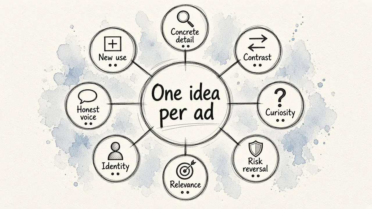
Line the examples up and a few techniques keep repeating:
| Technique | Examples | When to use it |
|---|---|---|
| Concrete detail instead of adjectives | Rolls-Royce, Monday.com, Upwork | Your claim needs proof |
| Contrast with the category | Volkswagen, Innocent, Hiut Denim | Competitors sound the same |
| Curiosity or a question | Miss Clairol, British Airways | Top-of-funnel attention |
| Risk reversal | Squarespace trial | Buyers hesitate to commit |
| Relevance to the searcher | Squarespace search, DKI test, LinkedIn callout | Search and B2B targeting |
| Identity and belief | Nike, Baron Fig | Premium or values-led brands |
| Honesty and voice | KFC, The Hustle | Recovering trust or building loyalty |
| New use for the product | Sunkist | Growing a category |
Three practical rules fall out of this:
- One idea per ad. Every example above commits to a single message. If your draft makes four points, you probably have four ads.
- Write for the format. On Facebook, only about 125 characters of primary text show before the cut. The headline gets roughly 40 characters and the description around 30. Shopify points to brands like Fly By Jing, Dieux Skin and Bed Threads as examples of attention-grabbing Facebook copy that fits these limits. A search ad, a LinkedIn post and a billboard each need a different shape.
- Test the small things. CTA verbs, the first line and the opening number are cheap to change and often move results more than a full rewrite.
Turning copy into a finished ad
Most of these examples only work because the visual carries half the message. VW's empty space, KFC's rearranged bucket and British Airways' plane overhead are all moments where words and image act together. A great headline on a weak image rarely survives a scroll.
This is where most small teams get stuck. You can write ten headline variants in an hour, but each one needs a matching creative, resized for every placement, before you can test it. A practical workflow:
- Write a one-line brief for each variant: audience, angle, and the single action you want.
- Generate the visual from the same brief. In EditorAI you describe the ad you want in plain text, and the ad creator produces the asset. Background removal, object removal and product photography tools let you clean up a real product shot so it matches the copy's promise.
- Keep visuals consistent across variants so your test isolates the copy. If the image changes too, you won't know which change won.
- Review every asset by hand for brand fit and for any claim you can't back up before it goes live.
- Cut losers weekly and build new variants from the winning angle.
If you'd rather draft headlines and visuals together, our walkthrough on an AI ad copy generator that works with your image design shows how to keep the two aligned. For video ads, the same rule applies: the first second of footage has to match the hook in your copy.
Quick answers
What makes ad copy convert? Relevance to the reader, one clear message, a specific detail that proves the claim, and a low-friction next step. Every example above combines at least two of these.
Should I copy these ads directly? Copy the technique, not the words. "Drink an Orange" worked because it fit Sunkist's situation. The underlying move, finding a new use for your product, is what transfers.
How many variants should I test? Enough to compare real alternatives without spreading your budget too thin. Start with a few headline angles on one consistent visual, find the winner, then test visuals against that winning line.
Can AI write ad copy that converts? AI is fast at generating variants and adapting copy to each format. The judgment about which idea is worth testing, and whether a claim is true, still belongs to a person. Use AI for volume and humans for the decision.
Great ad copy is rarely about clever wording. It comes down to knowing exactly who you're talking to, saying one thing they care about, and making the next step easy. Pick the three techniques above that fit your product best, write a variant for each, pair them with a clean visual in EditorAI, and let your own results tell you which one converts.